DataFrame.plot#
import pandas as pd
from sklearn import datasets
import seaborn as sns
sns.set()
まずはデータの作成
iris = datasets.load_iris()
df = pd.DataFrame(iris.data)
df.columns = iris.feature_names
df["label"] = iris.target
df.head()
| sepal length (cm) | sepal width (cm) | petal length (cm) | petal width (cm) | label | |
|---|---|---|---|---|---|
| 0 | 5.1 | 3.5 | 1.4 | 0.2 | 0 |
| 1 | 4.9 | 3.0 | 1.4 | 0.2 | 0 |
| 2 | 4.7 | 3.2 | 1.3 | 0.2 | 0 |
| 3 | 4.6 | 3.1 | 1.5 | 0.2 | 0 |
| 4 | 5.0 | 3.6 | 1.4 | 0.2 | 0 |
折れ線グラフ#
df.plot()
<Axes: >
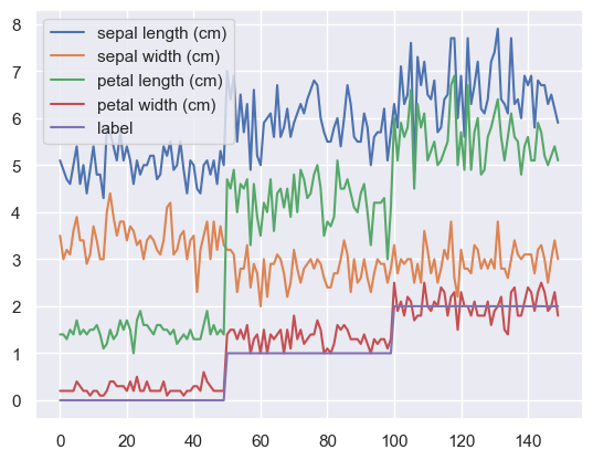
散布図#
df.plot(kind="scatter", x=0, y=1)
<Axes: xlabel='sepal length (cm)', ylabel='sepal width (cm)'>
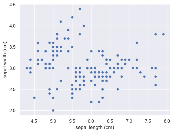
クラスごとに色を変えてみましょう#
df.plot(
    kind="scatter",  # グラフの種類を指定
    x=0,             # x軸に対応する列の番号か列名
    y=1,             # y軸に対応する列の番号か列名
    c="label",       # 点の色を指定する列の番号か列名
    cmap="summer",   # 色合いの指定
    title="iris"     # プロットのタイトル
)
<Axes: title={'center': 'iris'}, xlabel='sepal length (cm)', ylabel='sepal width (cm)'>
棒グラフ#
可視化を簡単にするために、ここでdf[“label”]を変更しています。
df2 = df.copy()
df2["label"] = [iris.target_names[i] for i in iris.target]
df2.head()
| sepal length (cm) | sepal width (cm) | petal length (cm) | petal width (cm) | label | |
|---|---|---|---|---|---|
| 0 | 5.1 | 3.5 | 1.4 | 0.2 | setosa |
| 1 | 4.9 | 3.0 | 1.4 | 0.2 | setosa |
| 2 | 4.7 | 3.2 | 1.3 | 0.2 | setosa |
| 3 | 4.6 | 3.1 | 1.5 | 0.2 | setosa |
| 4 | 5.0 | 3.6 | 1.4 | 0.2 | setosa |
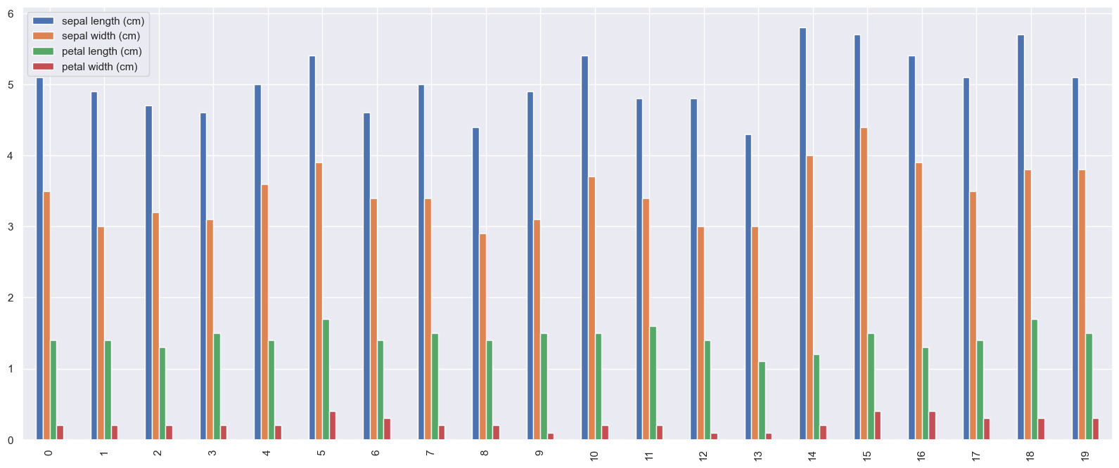
df2[:20].plot(kind="bar", figsize=(20,8))
<Axes: >
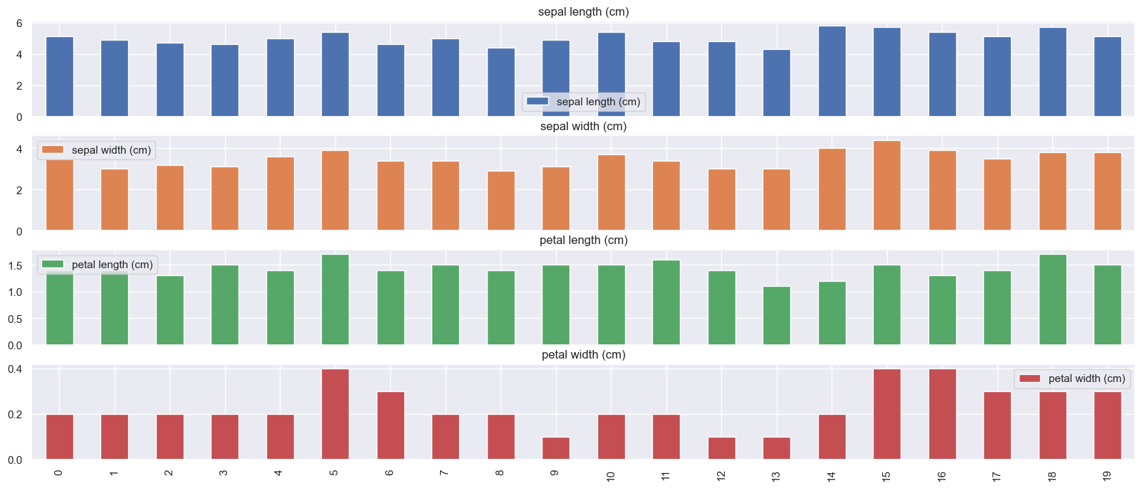
特徴ごとにsubplotで別のプロットにしてみます#
df2[:20].plot(kind="bar", figsize=(20,8), subplots=True)
array([<Axes: title={'center': 'sepal length (cm)'}>,
       <Axes: title={'center': 'sepal width (cm)'}>,
       <Axes: title={'center': 'petal length (cm)'}>,
       <Axes: title={'center': 'petal width (cm)'}>], dtype=object)
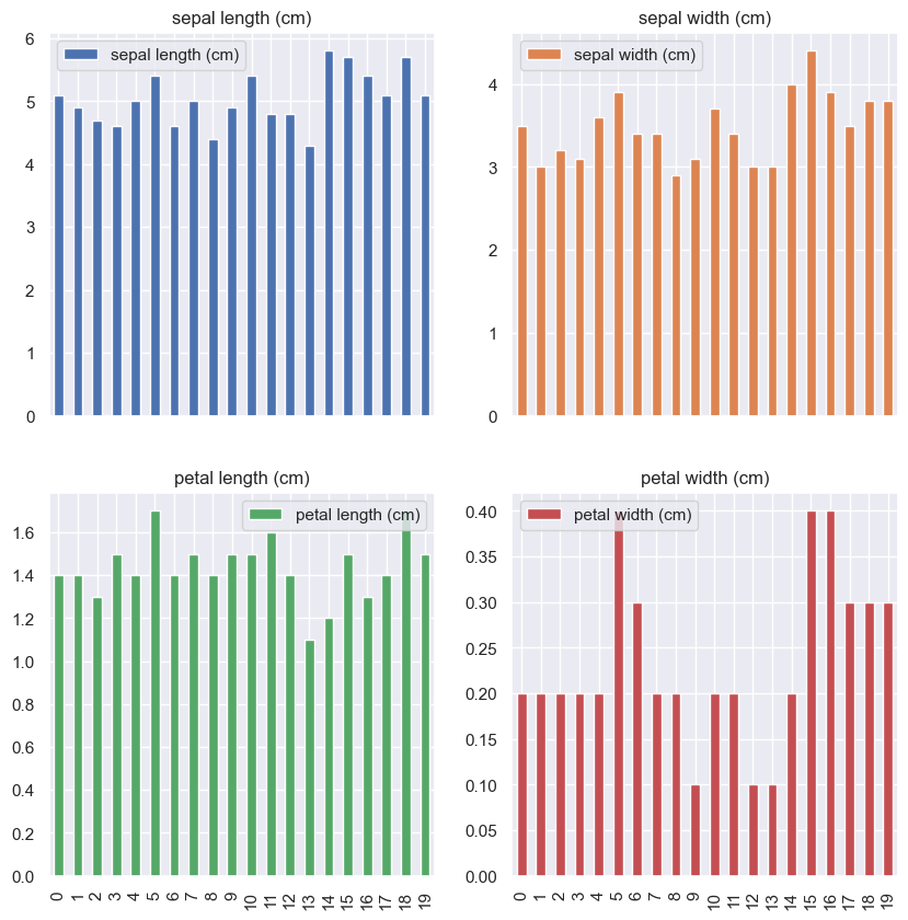
subplotsのlayoutを変えてみます。#
df2[:20].plot(        # データ数が多いので上から20個だけ使います
    kind="bar",       # グラフ種類
    figsize=(10,10),  # グラフのサイズを指定します。
    subplots=True,    # Trueにするとグラフが要素ごとに別々に描画されます。
    layout=(2,2)      # グラフのlayoutを指定します。グラフの数を考慮してください。
)
array([[<Axes: title={'center': 'sepal length (cm)'}>,
        <Axes: title={'center': 'sepal width (cm)'}>],
       [<Axes: title={'center': 'petal length (cm)'}>,
        <Axes: title={'center': 'petal width (cm)'}>]], dtype=object)
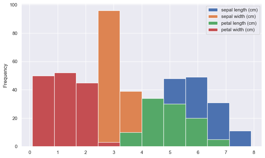
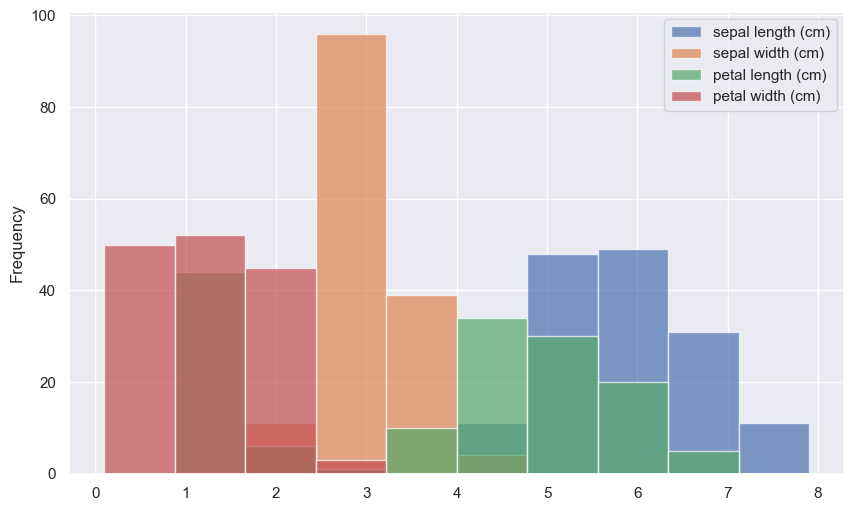
ヒストグラム#
df2.plot(kind="hist", figsize=(10,6))
<Axes: ylabel='Frequency'>
透過率alphaを変えてみましょう。#
df2.plot(
    kind="hist",       # グラフの種類
    figsize=(10,6),    # プロットのサイズ(お好みで)
    alpha=0.7          # 透過させる場合は適当な数字を指定しましょう。
)
<Axes: ylabel='Frequency'>
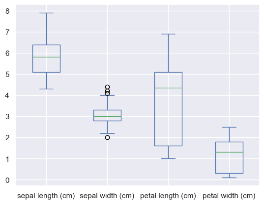
箱ひげ図#
df2.plot(kind="box")
<Axes: >
この他にplotで使えるkind#
help(df.plot)で確認ができます。
kind
| - ‘line’ : line plot (default)
| - ‘bar’ : vertical bar plot
| - ‘barh’ : horizontal bar plot
| - ‘hist’ : histogram
| - ‘box’ : boxplot
| - ‘kde’ : Kernel Density Estimation plot
| - ‘density’ : same as ‘kde’
| - ‘area’ : area plot
| - ‘pie’ : pie plot
| - ‘scatter’ : scatter plot
| - ‘hexbin’ : hexbin plot
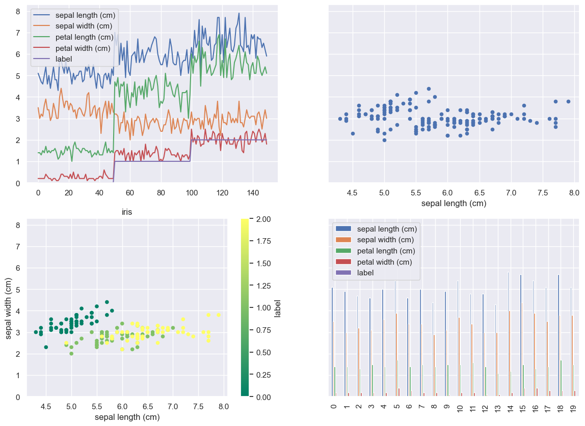
発展#
matplotlibと組み合わせると、下のようなプロットも作れます。
import matplotlib.pyplot as plt

fig, axes = plt.subplots(2, 2, figsize=(14, 10), sharey=True)
df.plot(ax=axes.flatten()[0])
df.plot(kind="scatter", x=0, y=1,ax=axes.flatten()[1])
df.plot(
    kind="scatter",
    x=0,
    y=1,
    c="label",
    cmap="summer",
    title="iris",ax=axes.flatten()[2]
)
df[:20].plot(kind="bar",ax=axes.flatten()[3])
<Axes: >