matplotlib#
import
import matplotlib.pyplot as plt # お約束のニックネーム

import numpy as np
y = np.random.rand(100)
x = np.linspace(1, 5, 100)
シンプルなグラフ#
折れ線グラフ#
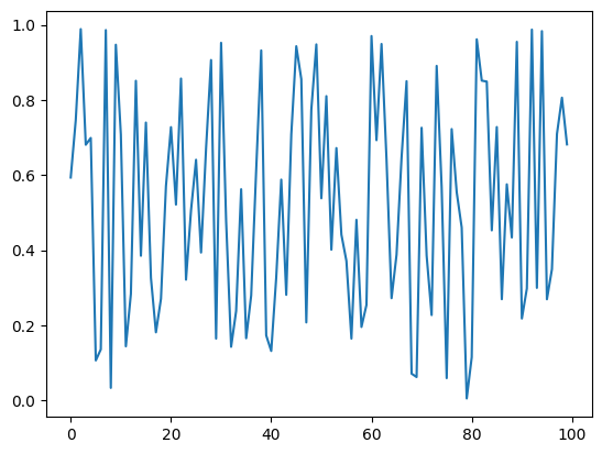
まずは何も考えずにグラフをplotしてみる
plt.plot(y)
[<matplotlib.lines.Line2D at 0x12f400fd0>]
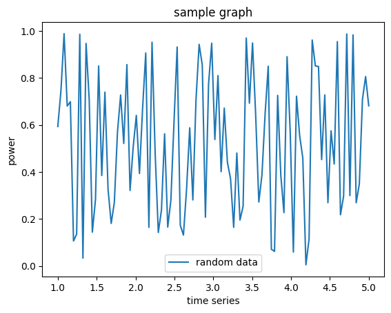
# グラフにラベルを付けてみる

plt.plot(x,y, label="random data")

plt.xlabel("time series")
plt.ylabel("power")

plt.title("sample graph")

plt.legend()
<matplotlib.legend.Legend at 0x12f304210>
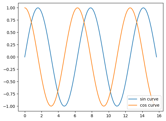
複数のグラフを表示したい#
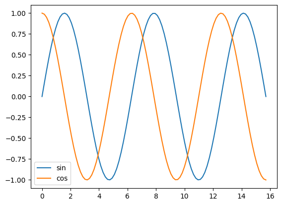
x = np.linspace(0, 5*np.pi, 100)

y_sin = np.sin(x)
y_cos = np.cos(x)

plt.plot(x, y_sin, label="sin curve")
plt.plot(x, y_cos, label="cos curve")

plt.legend()
<matplotlib.legend.Legend at 0x12f632490>
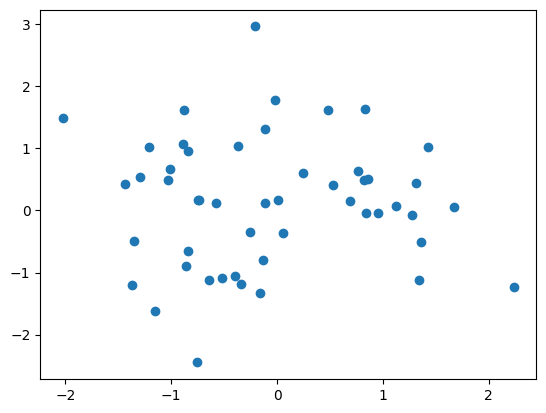
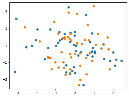
scatter plot#
x = np.random.randn(50)
y = np.random.randn(50)
plt.scatter(x,y)
<matplotlib.collections.PathCollection at 0x12f6ca0d0>
x1 = np.random.randn(50)
y1 = np.random.randn(50)
plt.scatter(x1,y1, label="x1")

x2 = np.random.randn(50)
y2 = np.random.randn(50)
plt.scatter(x2,y2, label="x2")
<matplotlib.collections.PathCollection at 0x12f2fe290>
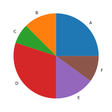
円グラフ#
x = np.array([10, 5,3, 12,6,4])

cate = ["A","B","C", "D", "E", "F"]
plt.pie(x, labels=cate)
([<matplotlib.patches.Wedge at 0x12f61ec50>,
  <matplotlib.patches.Wedge at 0x12f7c4bd0>,
  <matplotlib.patches.Wedge at 0x12f7d3650>,
  <matplotlib.patches.Wedge at 0x12f7e97d0>,
  <matplotlib.patches.Wedge at 0x12f7eab90>,
  <matplotlib.patches.Wedge at 0x12f7f0250>],
 [Text(0.7778174593052024, 0.7778174593052023, 'A'),
  Text(-0.42095177560159874, 1.0162674857624154, 'B'),
  Text(-0.9379041861706844, 0.5747484124062514, 'C'),
  Text(-0.8899186574910393, -0.6465638275138399, 'D'),
  Text(0.49938965983060557, -0.98010712049973, 'E'),
  Text(1.0461622140716127, -0.3399185517867209, 'F')])
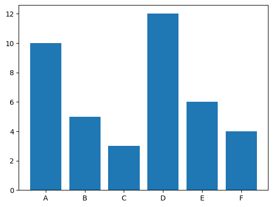
棒グラフ#
plt.bar(cate ,x)
<BarContainer object of 6 artists>
matplotlibのsubplot関数で、複数のプロットをまとめて描画しよう#
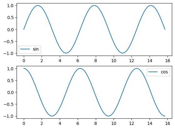
plt.subplotの引数の意味を下の図でチェック。
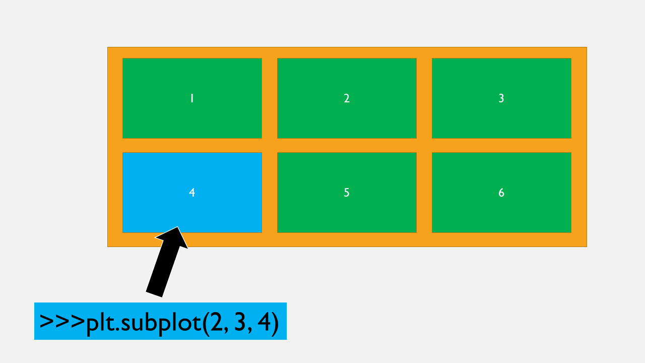
以下の図を、subplotを使った形に直してみます。
x = np.linspace(0, 5*np.pi, 100)

y_sin = np.sin(x)
y_cos = np.cos(x)

plt.plot(x, y_sin, label="sin")
plt.plot(x, y_cos, label="cos")

plt.legend()
<matplotlib.legend.Legend at 0x12f6ff0d0>
# 1つ目のプロット
plt.subplot(2,1,1)
plt.plot(x, y_sin, label="sin")
plt.legend()

# 2つ目のプロット
plt.subplot(2,1,2)
plt.plot(x, y_cos, label="cos")
plt.legend()
<matplotlib.legend.Legend at 0x12fa4fbd0>
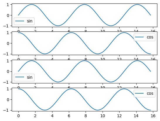
プロットの数を増やしてみましょう
# 1つ目のプロット
plt.subplot(4,1,1)
plt.plot(x, y_sin, label="sin")
plt.legend()

# 2つ目のプロット
plt.subplot(4,1,2)
plt.plot(x, y_cos, label="cos")
plt.legend()

# 3つ目のプロット
plt.subplot(4,1,3)
plt.plot(x, y_sin, label="sin")
plt.legend()

# 4つ目のプロット
plt.subplot(4,1,4)
plt.plot(x, y_cos, label="cos")
plt.legend()
<matplotlib.legend.Legend at 0x12fcbbf90>
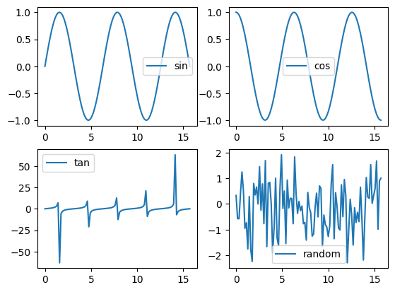
列も増やしてみましょう。
# 1つ目のプロット
plt.subplot(2,2,1)
plt.plot(x, y_sin, label="sin")
plt.legend()

# 2つ目のプロット
plt.subplot(2,2,2)
plt.plot(x, y_cos, label="cos")
plt.legend()

# 3つ目のプロット
plt.subplot(2,2,3)
y_tan = np.tan(x)
plt.plot(x, y_tan, label="tan")
plt.legend()

# 4つ目のプロット
plt.subplot(2,2,4)
y_random = np.random.randn(len(y_tan))
plt.plot(x, y_random, label="random")
plt.legend()
<matplotlib.legend.Legend at 0x12fa0b550>
matplotlib.animationでアニメーションを作る#
matplotlibには、アニメーションを作るモジュールのmatplotlib.animationがあります。
このnotebookでは、これを使って二種類のアニメーション作成の方法を試していきます。
まずは必要なライブラリをimportしましょう。
また、juputer notebook上でアニメーションを表示するには、%matplotlb notebookというマジックコマンドを使う必要があります.
%matplotlib notebook

from matplotlib import animation
既データが出揃っている場合のアニメーションの作り方#
ここでは、animation.ArtistAnimationを使います。
この関数は、第二引数にアニメーションにしたいプロットを格納したリストを渡すことで、リストの先頭から連続で表示してくれます。
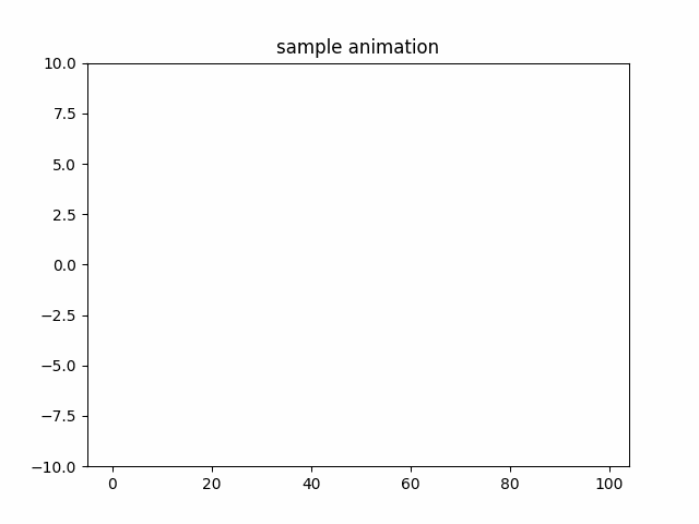
fig = plt.figure()
ims = []

y = []
for i in range(100):
    y.append(np.random.randn(1)[0])
    img = plt.plot(y)         # グラフを作成
    plt.title("sample animation")
    plt.ylim(-10,10)
    ims.append(img)                  # グラフを配列に追加
# 100枚のプロットを 100ms ごとに表示するアニメーション
ani = animation.ArtistAnimation(fig, ims, interval=100)

ani.save('anim1.gif', writer="pillow")
作成されたanim.gifを表示してみる.
もしも作ったアニメーションを保存したい場合は以下の関数を使います。
ani.save('sample_gif.gif', writer='pillow')
ani.save('sample_gif.gif', writer='imagemagick') # その他いくつかのwriterがあるようです.
第一引数がファイル名、第二引数がgifを作るために使うソフト名です。
imagemagickを使いたい場合の設定:
imagemagickをインストールしていない場合はこれをインストールして、matplotlibrcにwriterソフトのパスを指定する必要があります。
matplotlibrcの場所を確認するには、
matplotlib.matplotlib_fname()
を実行します。
表示されたファイルパスをテキストエディタで開いて、
animation.convert_path: "convert"
と書かれているところを見つけてください。
これを
animation.convert_path: writerソフトのパス
に書き直せばanimation.saveが使えます。
リアルタイムに描画したいデータが作られる場合のアニメーションの作り方#
animation.FuncAnimationを使います。
この関数は「第二引数にアニメーションとして表示したいプロットを作る関数」を渡すことで、リアルタイムにアニメーションを表示します。
機械学習のモデルの学習状況のモニタリングなどに使えそうですね。
fig = plt.figure()

xlim = [0,100]
X, Y = [], []

def plot(data):
    plt.cla()                   # 前のグラフを削除

    Y.append(np.random.random())   # データを作成
    X.append(len(Y))

    if len(X) > 100:            # 描画範囲を更新
        xlim[0]+=1
        xlim[1]+=1

    plt.plot(X, Y)              # 次のグラフを作成
    plt.title("sample animation (real time)")
    plt.ylim(-1,2)
    plt.xlim(xlim[0],xlim[1])


# 10msごとにplot関数を呼び出してアニメーションを作成
ani = animation.FuncAnimation(fig, plot, interval=10, blit=True)
#ani.save('anim2.gif', writer='pillow')
plt.show()